

These shows can do well but an issue with marketing them is that there are a lot of opportunities to see stand-up in Edinburgh and a random trio of comics is not doing much to stand out. Instead it can be better to group the comics around a theme and market accordingly. It could be OAP comedy, or a nerd show, or a show where all the comics are into heavy metal (and if one of you doesn’t fit the bill you can always do the gag that they are the token classical music fan).
FLYERS & POSTERS
Once you have a clear (possibly niche) angle, a title and a strong identity your show becomes an easier sell – and indeed the focus helps the writing and construction of the show. It’s at this point that I really get down to work with a comic. Looking at all the possible material that could be in the show, identifying new stuff that needs writing, structuring it, watching videos of previews and feeding back and even sometimes getting them stood up in front of me running through it. I’ll even advise on flyers and posters.
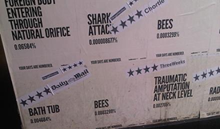
My main feeling as regards flyers and posters is it’s good to have something clean and simple to cut through the noise of images, photos and graphics at the Fringe. For example, for “Your Days Are Numbered: The Maths of Death” I suggested that each poster have a simple white background with a large statistic in black on it. There were several different posters in the series featuring your chances of dying in various ways: falling out of bed, falling off a ladder, being hit by a meteorite – and even your chance of dying during the show. (No one did).
This kind of thinking began for me back in the day when I was cutting my comedy teeth and doing shows with comic, Angel Comedy boss and MC extraordinaire Barry Ferns. We were doing a double-act and – not wanting to go down the “Head & Ferns” route - we called ourselves “Doreen”. (This pleasingly led to the Daily Mail getting in touch as they were doing a piece on female comics and wanted to quote one of Doreen’s jokes).
After all the costs of mounting an Edinburgh show we had no money to get flyers designed and printed. So we handed out photocopied A5 pieces of paper on which we had scrawled the words “Look How Shit Doreen’s Flyers Are”. That’s all they said. No further information was offered. That anti-marketing campaign – so cheap to do – was probably the most successful of any show I’ve been involved in.
So returning to “Four Weedings & A Funeral: Life & Death on A London Allotment”, I might suggest the posters simply have a stylised allotment with a gravestone at the head of it. Or maybe something even more minimal. A skull with a spade impaled in it. Or perhaps the flyers could be packets of seeds with an invitation to a funeral stapled to it. That kind of eye-catching marketing combined with the clear title and angle will immediately capture the interest of the niche audience we’re going for and we’ll be busy with muddy booted green fingered types, death obsessives and all the people they dragged along with them.
Buy A Director's Guide to the Art of Stand-up here.

